

A pale gray caption can disappear for someone with aging eyes, low vision, color blindness, or sunlight hitting a phone screen. Color contrast on websites for accessibility makes text, controls, and messages easier to perceive in those everyday conditions.
Better contrast helps everyone read faster and make fewer mistakes. The practical standards, testing tools, common failures, and fixes below can help you build pages that stay clear across devices and settings.
Color Contrast on Websites for Accessibility: What It Means
Color contrast is the difference in brightness between text or an important interface element and its background. When contrast is weak, visitors may struggle to read a sentence, find a button, or tell whether a form field contains an error.
Contrast isn’t only about making body copy darker. It also affects navigation, chart data, focus rings, status messages, form borders, and selected states.
Who Benefits From Better Website Contrast?
People with low vision and color vision deficiencies rely on clear separation between foreground and background colors. Cataracts, migraines, and age-related vision changes can also reduce sensitivity to contrast.
Temporary problems matter, too. Bright glare, a cracked display, low screen brightness, or a poor-quality monitor can make a borderline design hard to use. Accessible contrast supports more people, on more devices, in more settings.
Why Color Alone Is Not Enough to Communicate Information
A red outline by itself doesn’t explain why a field failed. Pair it with an error icon and direct text such as “Enter a valid email address.” The same rule applies to required fields, success notices, links, charts, and status labels.
Links in paragraph text should have an underline or another persistent visual cue besides color. W3C’s guidance on using color explains that color cannot be the only visual way to communicate information.
WCAG Contrast Ratios Every Website Owner Should Know
The Web Content Accessibility Guidelines, commonly called WCAG, give measurable contrast targets. WCAG 2.1 and the current WCAG 2.2 standard use ratios that run from 1:1, no difference, to 21:1, black against white.
The calculation uses relative luminance, not whether a color combination looks appealing to the design team. A brand palette can still feel distinctive while meeting the minimums.
The 4.5:1 and 3:1 Text Contrast Rules
WCAG AA requires a contrast ratio of at least 4.5:1 for normal text. Large text may use 3:1. Large text means at least 18-point regular type, or 14-point bold type, which many web tools convert to pixel values.
Check placeholder text, form labels, buttons, navigation, captions, and text within cards. W3C’s contrast minimum explanation also covers how expected foreground and background pairs should be evaluated.
Stricter Requirements for Enhanced Accessibility
WCAG AAA sets a higher target: 7:1 for normal text and 4.5:1 for large text. AAA is a stronger goal, not a universal legal requirement.
Follow the standard, contract, or organizational policy that applies to your site. When a page contains long-form reading, higher contrast often improves comfort even when AA already passes.
Contrast Rules for Icons, Borders, Focus States, and Controls
Meaningful non-text elements generally need a 3:1 contrast ratio against adjacent colors. This includes input borders, icons, chart marks, and visible control boundaries.
Keyboard focus indicators need enough contrast to remain visible when users tab through links and controls. Decorative artwork doesn’t need to meet this rule, but a graphic that communicates information does. W3C’s non-text contrast guidance clarifies that distinction.
How to Test and Fix Website Color Contrast
Test individual components, not only the colors listed in a style guide. A passing navy heading doesn’t prove that its disabled button, pale alert banner, or hover state also passes.
Reliable Color Contrast Testing Tools
The WebAIM Contrast Checker lets you enter or sample foreground and background colors, then check ratios against WCAG levels. Use it with the actual font size and weight on the page.
WAVE, axe DevTools, and Lighthouse can flag contrast failures across a page. Browser developer tools help inspect computed colors, while Stark supports checks inside design software. Automated results are useful, but they can’t judge every visual context.
A Simple Process for Improving Weak Contrast
Adjust one variable at a time. Darken text, lighten the background, or choose a stronger brand shade before changing several colors at once. If text sits on a photo, add a solid panel or a sufficiently opaque overlay behind it.
Then test every state: hover, focus, disabled, visited, selected, and error. A button that passes at rest can still fail when a visitor interacts with it.
Manual Checks That Automated Scanners May Miss
Review text over gradients, transparent layers, background images, and changing media. Inspect custom widgets and charts by hand, especially when colors shift after a click or filter selection.
Use keyboard navigation, browser zoom, dark mode, and high-contrast system settings. Checking a page on different screens can reveal low-contrast details that a single desktop monitor hides.
Common Contrast Mistakes and Better Design Choices
Accessible design doesn’t require dull colors or a black-and-white brand. It asks designers to protect legibility whenever color carries content or guides an action.
Light Gray Text, Placeholder Text, and Thin Fonts
Light gray text often looks polished in a mockup but fades on real screens. Thin fonts can create the same problem, even when a checker reports an acceptable color ratio.
Choose a readable weight, adequate type size, and strong text contrast. Labels should remain visible outside the field, because placeholders disappear when someone starts typing.
Links, Buttons, and Focus Indicators That Blend In
Within body copy, underlined links are the safest default because readers can identify them without relying on color. Buttons also need a visible boundary or strong fill contrast.
Hover and focus styles have separate jobs. Pointer users benefit from hover feedback, while keyboard users need a prominent focus indicator that doesn’t vanish into the page background.
Images, Gradients, Charts, and Dark Mode
Place text over the quietest area of an image, or use an overlay or solid text panel. Don’t assume a dark image stays dark enough on every crop or screen.
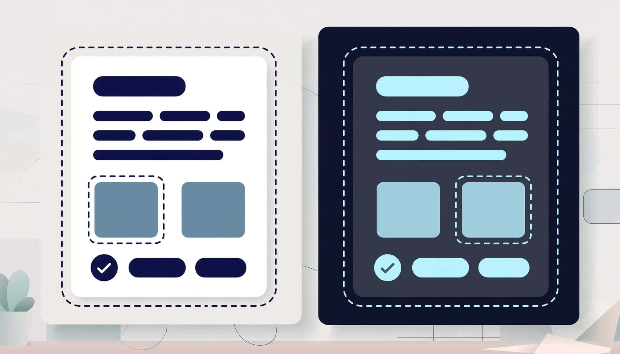
Charts need labels, symbols, textures, or patterns alongside color. Treat dark mode as its own palette, then test every foreground, background, border, and state rather than simply inverting colors.
Readability Is a Core Website Requirement
Start with 4.5:1 for normal text and 3:1 for large text and meaningful non-text controls. Use the stronger AAA ratios when they fit the project’s goals and content.
Test contrast early, then revisit it during design updates and content changes. Readable contrast is a basic part of a usable website, not an optional visual upgrade.