A brochure doesn’t speak all at once. It opens panel by panel, like a hallway of small doors, and each door changes what the reader sees next.
For business owners and marketing directors, that matters more than it may seem. Brochure folding options shape how a message unfolds, how easy it is to scan, and how polished the piece feels in someone’s hands. The right fold can make a simple offer feel clear. The wrong one can make strong content feel cramped.
What brochure folding options really change for your marketing
Fold choice affects more than shape. It changes pacing, panel space, first impressions, mailing costs, and how well your call to action lands. A flashy fold isn’t always the best choice. Most of the time, the right fold is the one that fits the message and the way people will open it.
A brochure’s fold is part of the story, not a finishing detail.
The fold controls the order people see your message
Each panel acts like a step in a conversation. The cover panel sets the tone. The inside spread explains the offer. The back panel often holds contact details, a call to action, or a quick summary.
Because of that, fold style shapes reading order. A tri-fold can guide readers from problem to solution. A gate fold can hide the main visual until the big reveal. A Z-fold can show a process in a clean, forward motion.
Size, paper, and finishing can change the final result
A fold on paper doesn’t always behave the way it looks on screen. Panel widths may need slight changes so the brochure closes neatly. Thick stock can crack if it isn’t scored first. Gloss coating feels slick and bright, while uncoated paper feels softer and more tactile.
Those details affect how professional the brochure feels in hand. They also need to match the rest of your printed identity. If you’re reviewing print pieces as part of a larger brand system, branding 101 basics can help connect the brochure to your other visual assets.
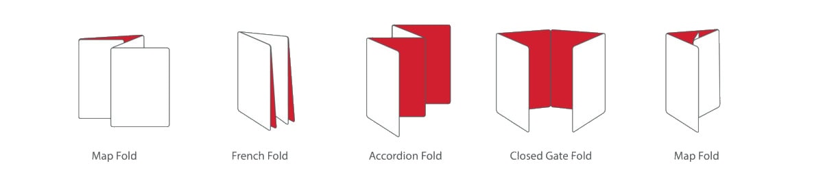
The most common brochure fold types and when to use each one
Most brochure formats fall into a few familiar shapes. If you’re comparing print and digital brochure options, these are the folds you’ll see most often.
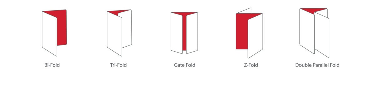
Bi-fold brochures work well when you need a clean, simple layout
A bi-fold brochure folds once and creates four panels. That gives you larger spaces for photos, headlines, and short blocks of copy. As a result, bi-folds feel orderly and polished.
This format fits company overviews, product sheets, menus, and sales leave-behinds with modest content. When you want room to breathe, a bi-fold is often the safest pick.
Tri-fold brochures are a popular choice for step-by-step messaging
The tri-fold is the classic brochure format. It creates six narrow panels and gives you a clear beginning, middle, and end. That’s why it shows up so often in healthcare, tourism, service marketing, and local promotions.
A tri-fold works best when your message needs sequence. You can introduce the problem on the cover, explain benefits inside, and close with the next step on the back.
Gate fold brochures make a strong first impression for big reveals
A gate fold has two outer panels that open to a wider center panel. That reveal creates drama, which makes this format a natural fit for luxury brands, real estate, product launches, and image-heavy campaigns.
It often feels more premium, and it often costs more, too. Printing, scoring, and mailing can all be less forgiving than with standard folds.
Z-fold brochures are useful when information needs to flow in sequence
A Z-fold opens like an accordion. Readers can open one panel at a time or spread it flat for a wider view. That makes it useful for timelines, service steps, event guides, maps, and visual storytelling.
Because the panels open in a steady rhythm, Z-folds help information move forward without feeling boxed in.
Double parallel and accordion folds fit content-heavy brochures
These formats give you more panels, but they open in different ways. A double parallel fold folds in half, then in half again. An accordion fold opens panel after panel in the same direction.
Both are useful for travel guides, program details, service breakdowns, and educational pieces. Still, more panels don’t solve weak editing. They demand sharper structure, shorter copy, and clearer visual hierarchy.
How to match the best fold style to your content, audience, and budget
Once you know the main fold types, the next job is choosing the one that fits the job in front of you.
Start with the goal, not the brochure template
First, ask what the brochure needs to do. Is it introducing your brand, backing up a sales pitch, promoting an event, or driving phone calls? That answer narrows the field fast.
A company overview often fits a bi-fold. A service walk-through may work better as a tri-fold or Z-fold. A launch piece with one hero image may deserve a gate fold.
Match the fold to how much content you really have
Many brochure problems start with wishful thinking. Teams pick a small format, then try to force in too much copy. Others choose extra panels simply because they’re available.
Short messages need space. Longer messages need structure. If you only have a few strong points, don’t spread them thin across too many panels. If you have more to say, choose a fold that gives each section a clear home.
Think about where and how the brochure will be used
Context matters. A fold that looks great on a trade show table may not mail well. A brochure that slips neatly into a rack may not create much drama in a face-to-face presentation.
Direct mail often favors standard sizes and simpler folds. Meanwhile, office handouts, sales packets, and in-store displays give you more freedom. Your audience’s habits should shape the choice as much as the design does.
Common brochure fold mistakes that can weaken the final piece
Even strong content can lose force when the fold and layout fight each other.
Choosing a fold that fights the message instead of helping it
A poor fold can interrupt reading order, bury key details, or split one idea across awkward panel breaks. Then the reader has to work too hard.
Plan content with the fold in mind from the start. Don’t write first and force-fit later. The structure should guide the message, not trap it.
Ignoring panel creep, margins, and fold mechanics
In some folds, inside panels must be slightly smaller so the brochure closes properly. Printers often call this panel creep. If your designer ignores it, edges can misalign and content can drift too close to fold lines.
Safe areas and trim matter, too. Logos, headlines, and phone numbers should stay clear of folds and edges. A neat brochure often comes down to these quiet details.
Using every panel does not mean every panel needs equal weight
Not every panel deserves the same attention. The cover should pull readers in. The main inside area should do the heavy lifting. The call to action should be easy to find.
Support panels can stay lighter. When every space shouts, nothing stands out.
Folding can be a strategy
Fold style is a strategy choice, not a small print detail. It shapes how your audience moves through the message and what they remember when they close the piece.
Simple folds suit simple stories. More layered folds suit guided reveals, step-by-step explanations, and content with more moving parts. Pick the fold based on purpose, content flow, and reader experience first, then move into design and printing with a clearer plan.
Additional Folding Options